All official European Union website addresses are in the europa.eu domain.
See all EU institutions and bodies
An official website of the European Union | How do you know?
Environmental information systems
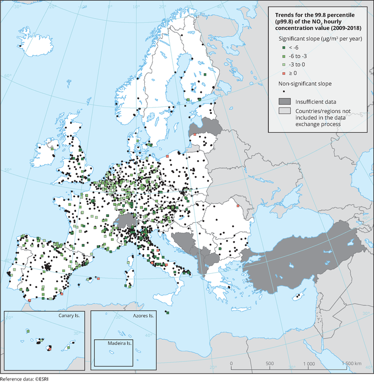
The map shows trend analysis considering 99.8 percentile (p99.8) of the NO2 hourly concentrations at monitoring sites. The coloured squares represent stations with "significant" trends, while the black dots represent stations with “non-significant” trends.
Loading