All official European Union website addresses are in the europa.eu domain.
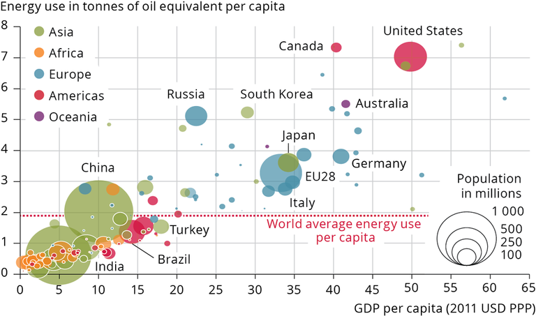
See all EU institutions and bodiesThe graph shows per capita energy consumption (kg oil equivalent) vs. per capita GDP, PPP (current international $). The size of the bubbles denotes total poulation per country. All values refer to the year 2011.
Loading

