All official European Union website addresses are in the europa.eu domain.
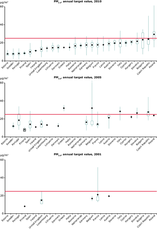
See all EU institutions and bodiesThe graphs are based on the annual mean concentration values; they present the range of concentrations at all station types (in μg/m3) officially reported by the EU Member States and how the concentrations relate to the target value set by EU legislation (marked by the red line).
The diagram indicates the lowest and highest observations, the means and the lower and upper quartiles. The lower quartile splits the lowest 25 % of the data and the upper quartile splits the highest 25 % of the data.
Loading

