All official European Union website addresses are in the europa.eu domain.
See all EU institutions and bodies
An official website of the European Union | How do you know?
Environmental information systems
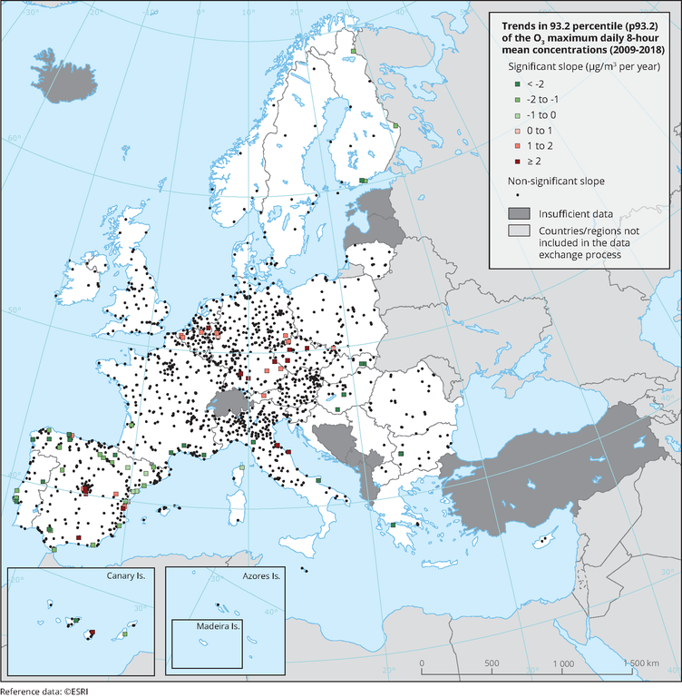
The map shows trend analysis considering the 93.2 percentile of O3 maximum daily 8-hour concentrations at monitoring sites. The coloured squares represent stations with "significant" trends, while the black dots represent stations with “non-significant” trends
Loading