All official European Union website addresses are in the europa.eu domain.
See all EU institutions and bodies
An official website of the European Union | How do you know?
Environmental information systems
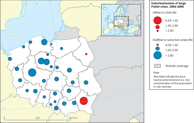
Blue dots indicate outflow to suburban areas; red dots indicate inflow to cities. The largest blue dots indicate areas in which there has been a 2.9 % or higher outflow of the urban population to the suburban area, medium-sized dots indicate a 1.45 %–2.9 % outflow and the smallest dots represent an outflow of 0.29 %–1.45 %. Red dots indicate the reverse phenomenon (i.e. the concentration of the population in city centres).
Source: Euroreg (2010).
Loading