All official European Union website addresses are in the europa.eu domain.
See all EU institutions and bodies
An official website of the European Union | How do you know?
Environmental information systems
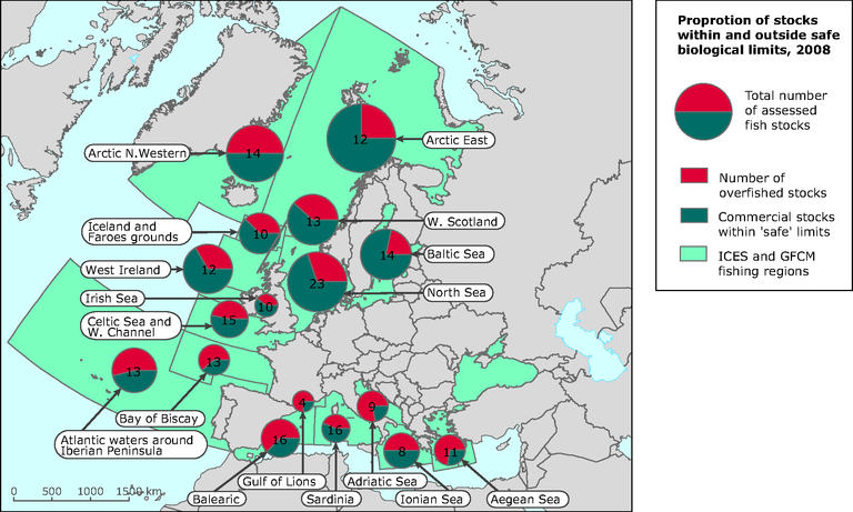
The chart shows the proportion of assessed stocks that are overfished (red) and stocks within safe biological limits (blue).
The numbers in the circles indicate the number of stocks assessed within the given region. The size of the circles is
proportional to the magnitude of the regional catch.
Loading