All official European Union website addresses are in the europa.eu domain.
See all EU institutions and bodies
An official website of the European Union | How do you know?
Environmental information systems
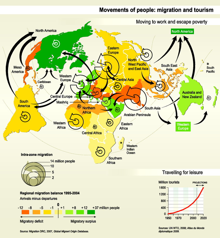
The map shows 'moving to work and escape poverty': Migration between and inside world regions from 1995 to 2004. Colors show regional migratory balance (surplus or deficit), arrows show major movements between and inside regions.
The graph shows 'travelling for leisure': trends in number of tourists since 1950 and projections to 2020.
Loading